🗃️
06 Dashboard, Analytics, and Reports
1. Dashboard Hierarchy
2. Core Dashboards & Widgets
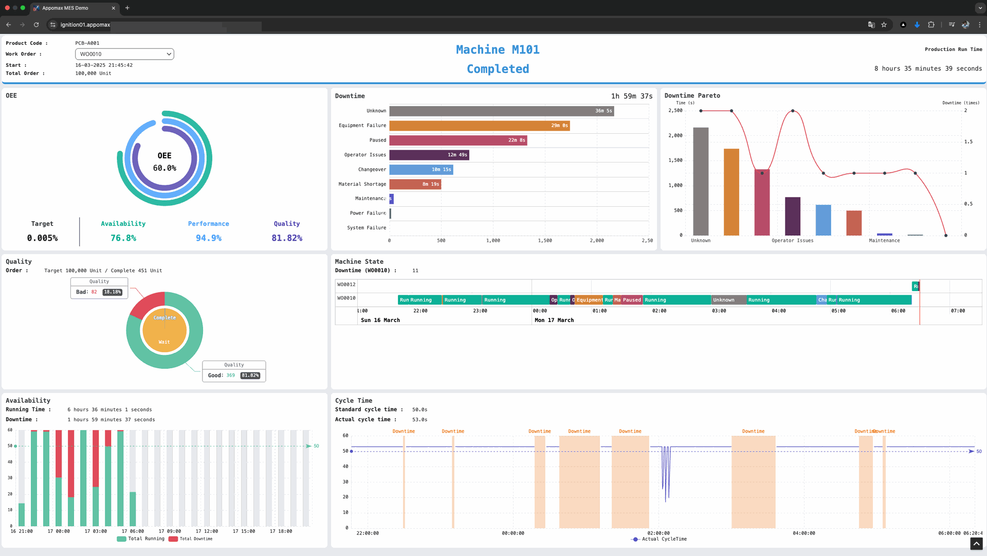
2.1 Station Execution Panel - Ignition Perspective View


Status Card – RUNNING / IDLE / DT Reason
Target vs Actual Counter (Gauge)
Cycle Time Sparkline (last 50 pcs)
Quick Actions – Pause, Downtime, Material Call
Next WO Info (if queued)
2.2 Shift-OEE Dashboard (Line Level) - Ignition or Tulip
| Widget | KPI / Chart |
|---|---|
| OEE Donut (A-P-Q Breakdown) | Availability, Performance, Quality |
| State Timeline (Gantt-bar) | Coloured by Reason Category |
| Downtime Pareto | Top 5 Unplanned Reasons |
| Throughput Trend | Cumulative OK count vs Ideal |
| Operator Leaderboard | Output per station |
2.3 WO Progress Board (Schedule View) - On Tulip
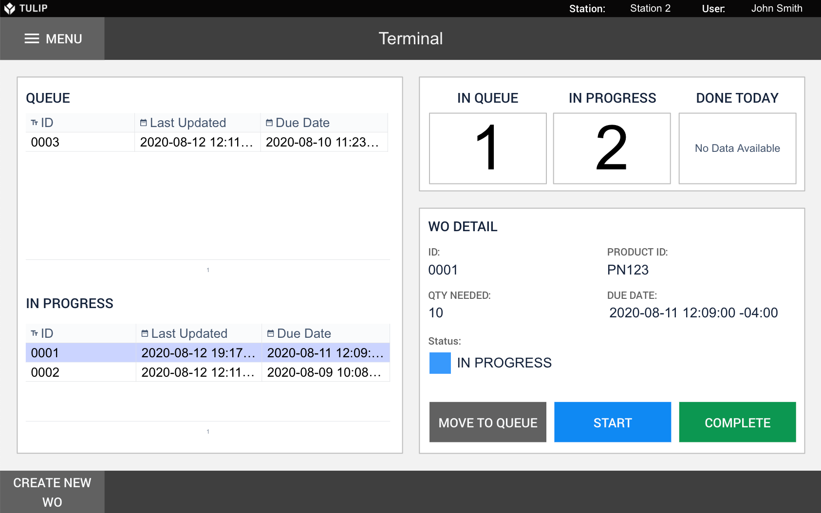
Kanban / Gantt – WO Status: Queued → Running → Complete
ETA vs Promise (Schedule adherence bar)
Exceptions – Runs behind target, high scrap %
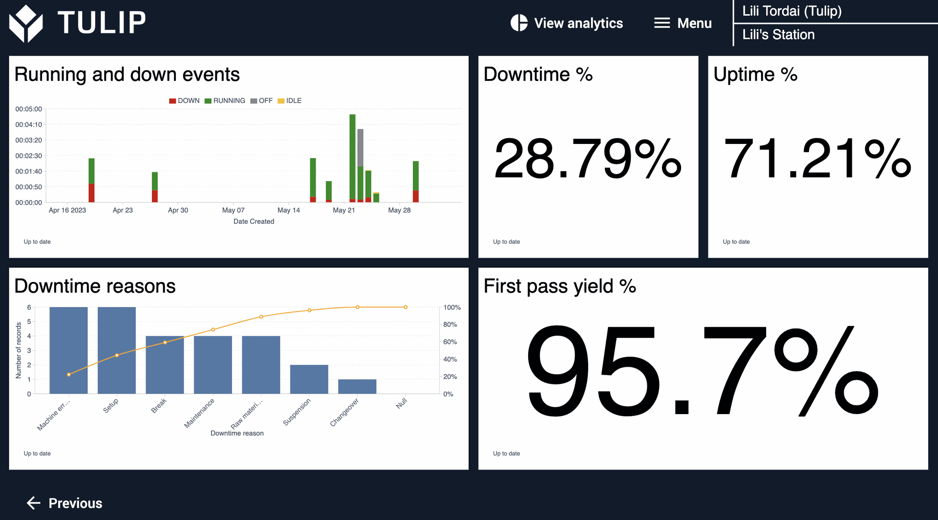
2.4 Quality / Scrap Analytics - On Tulip

Defect Pareto (Counttype = NG/Waste) by ReasonCode
NG Heat-map (day × shift)
Yield Trend Line (last 30 runs)
Drill-down to Run Report (Step 4)
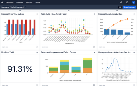
2.5 Run Report - Tulip or BI application.
Header: WO, Product, Operator, Line
KPI: OEE, Good/NG, Downtime mins
Attachments: Setup checklist answers, e-Signatures, photos
Downloadable PDF
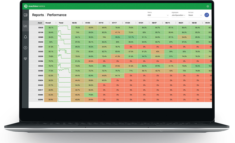
2.6 Management KPI Cockpit (Site / Enterprise)
| Tile | Description |
|---|---|
| Daily OEE Trend (bar w/ target line) | Past 14 days per site |
| Top 3 Lines by Downtime | Small multiples |
| Production Volume vs Plan | Stacked column (Good, Scrap) |
| MTBF / MTTR | Cards + sparkline |
| Energy / Sustainability (optional) | Add later via EMS data |